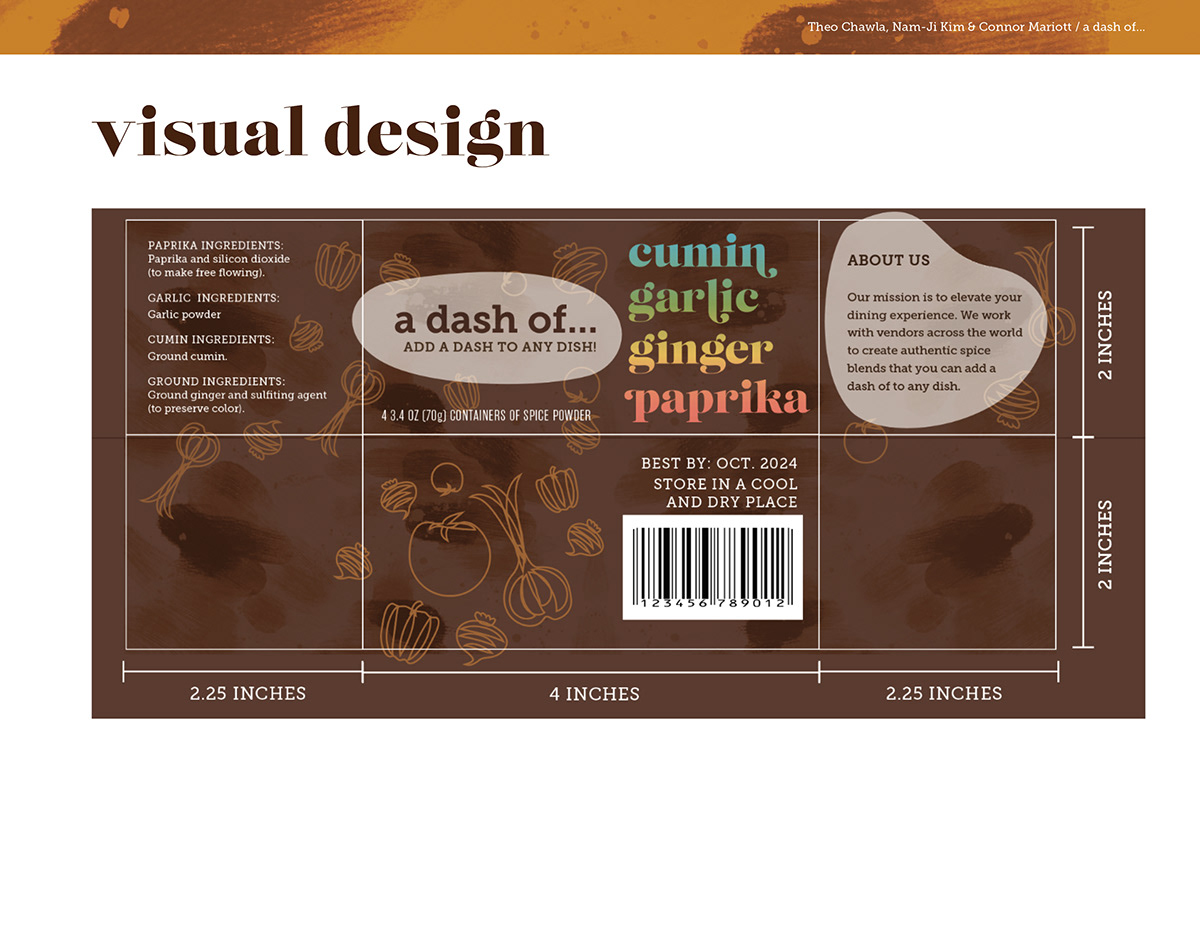
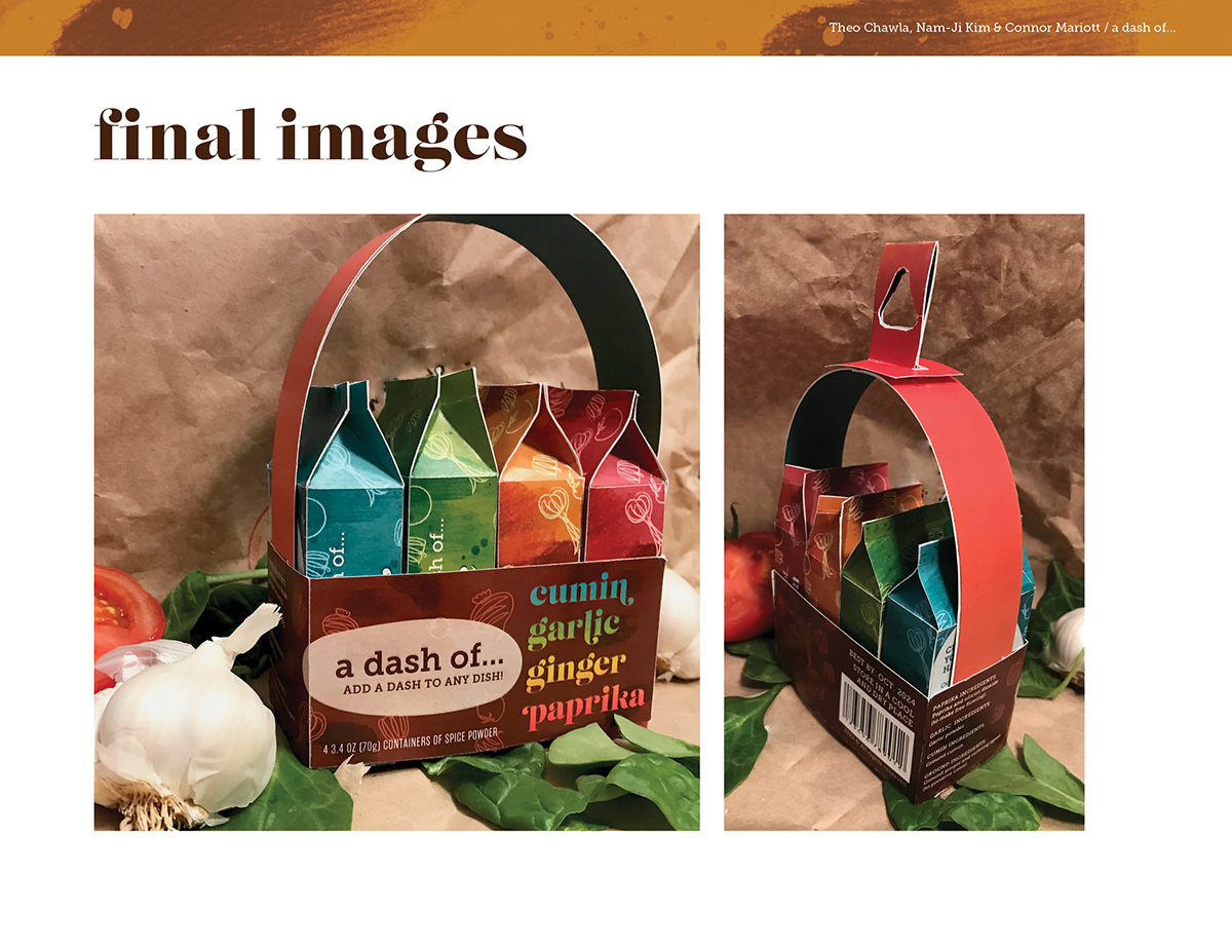
Concept:
We wanted our spice packaging to be colorful, playful, and accessible. To do this, we used retro serif typography, textures, and outlined lively illustrations. We chose spices that should be a staple in any kitchen to get any new cook started.
Target Consumer:
Our target consumer is young, new cooks who are looking for an easy way to start adding spices to their dishes.
Roles & Contributors:
Theo Chawla: Initial illustration, bottom tabs, sketches, prototyping, box label general layout, final presentation.
Nam-Ji Kim: Ideation, process sketches, editing photographs for process prototypes, prototyping.
Connor Mariott: Ideation & sketches, prototyping & printing, assembly, staging & photography of final product.